Galway Seasonal
Halloween in Galway — An Ancient Irish Tradition Still Alive
Galway City, Ireland
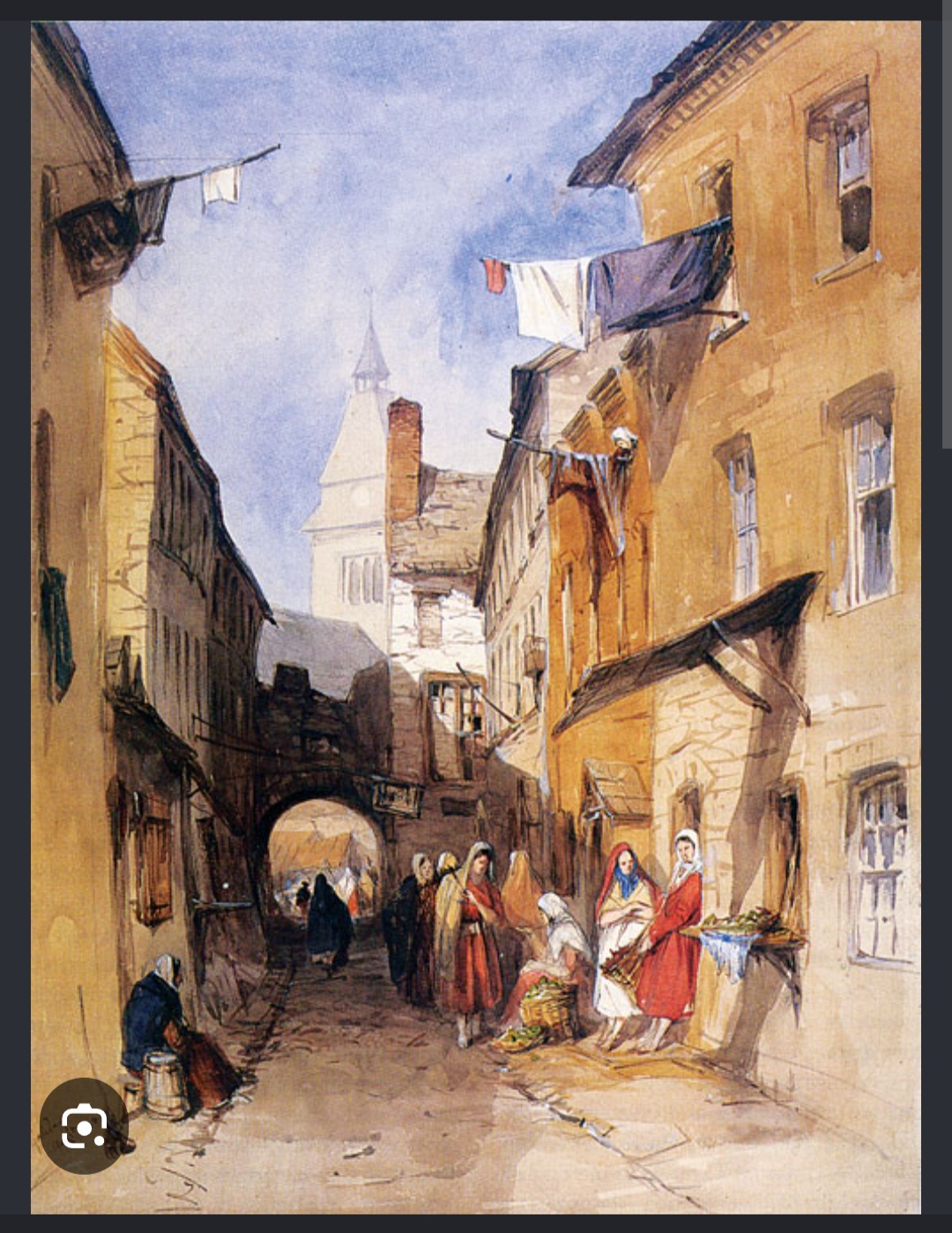
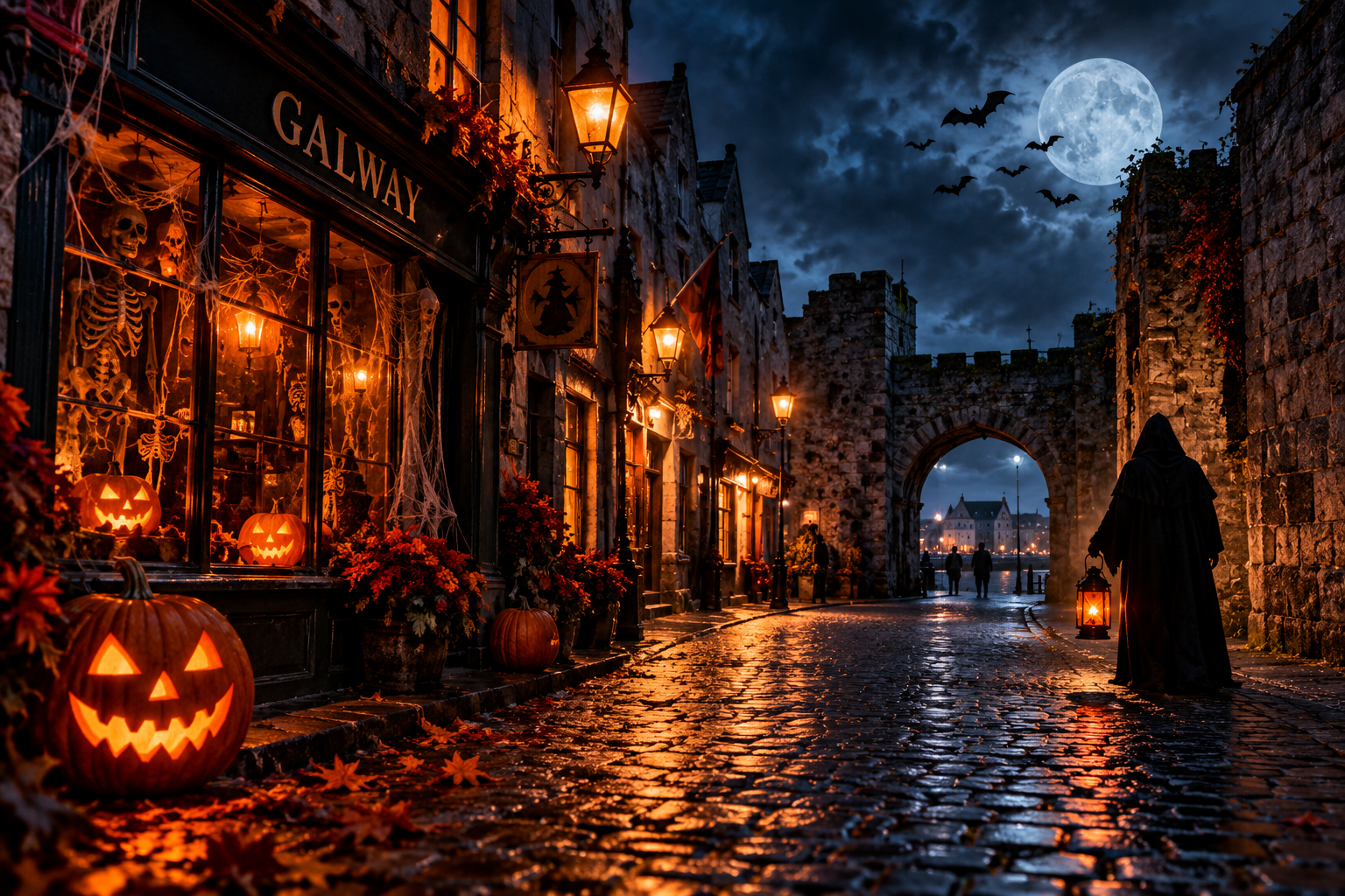
As October draws towards its final night, Galway City begins to take on a different appearance. Pumpkins, costumes, skeletons and Halloween decorations appear in shop windows, while the city's medieval streets provide a fitting backdrop for the season.
But Halloween is much older than the decorations we recognise today.
Its roots reach back to Samhain, an ancient Gaelic festival marking the end of the harvest season and the beginning of winter. Traditionally observed around the transition from October into November, Samhain occupied an important place in the seasonal calendar of Ireland.
In Irish folklore, this was a time when the boundary between the living and the supernatural was believed to become unusually thin. Spirits, otherworldly beings and strange encounters belonged to the stories associated with this turning of the year.
Over centuries, these older traditions became intertwined with the Christian observance of All Saints' Day. The evening before became known as All Hallows' Eve, from which the name Halloween developed.
Even the familiar carved Halloween lantern has an Irish connection.
Before pumpkins became the popular choice, people in Ireland carved frightening faces into turnips. Irish emigrants helped carry Halloween customs across the Atlantic, where pumpkins proved much easier to carve.
Today, Halloween is celebrated across much of the world, but Ireland remains one of the places where its oldest cultural roots can still be traced.
And Galway has an atmosphere particularly suited to the occasion.
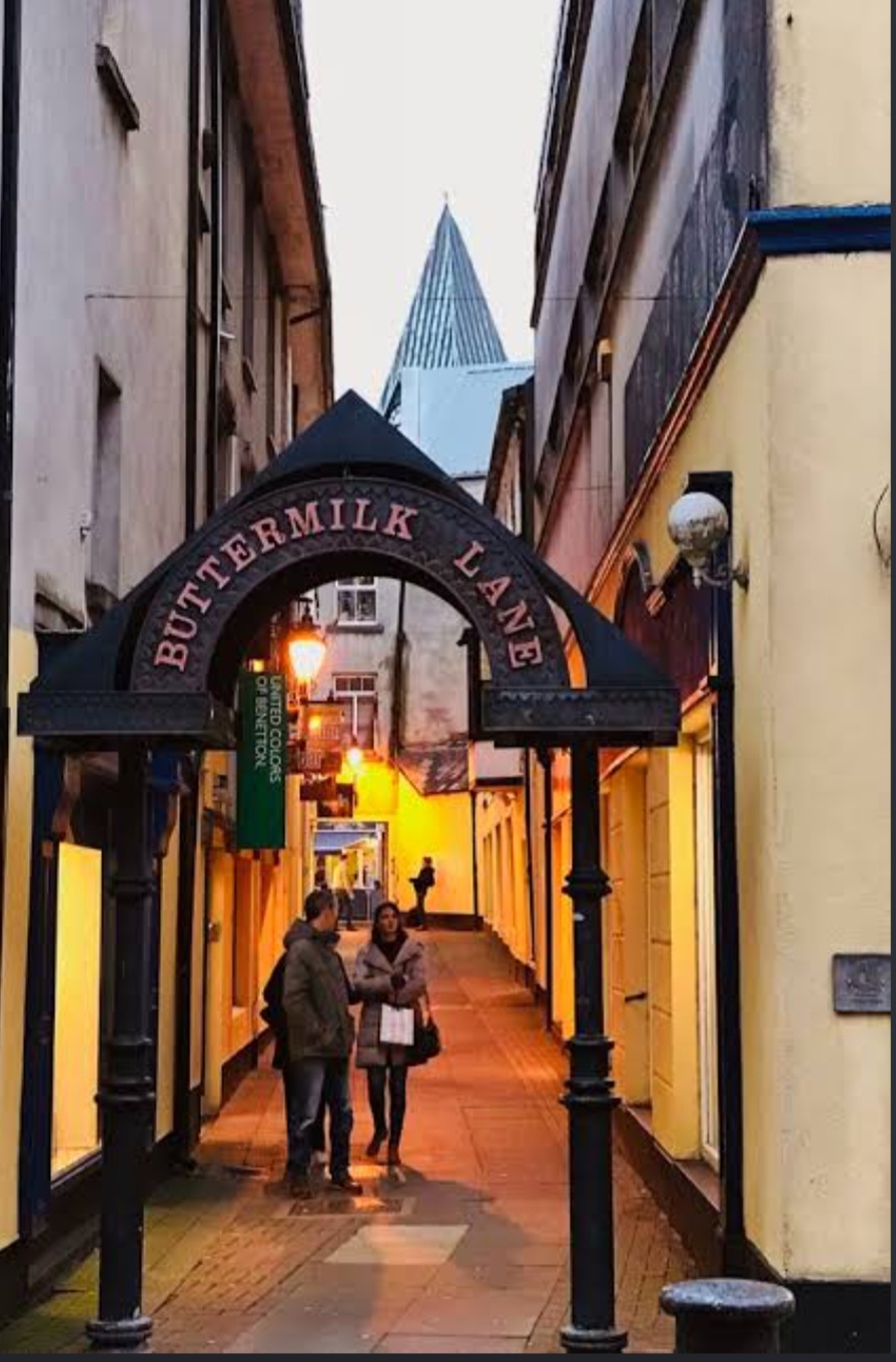
Walk through the Latin Quarter after darkness falls. Pass beneath the old stonework, wander along the narrow streets, or stand near the Spanish Arch with the autumn air coming in from Galway Bay.
The city does not need much assistance from Halloween decorations to remind us that it has been standing here for centuries.
On Friday, 31 October 2026, Halloween will once again bring costumes, celebrations and a little theatrical mischief to Galway.
And behind all the modern entertainment remains something much older: an Irish tradition that has travelled around the world and returned each October to the streets where its history still feels close at hand.
Halloween may now belong to the world.
But some of its oldest roots are right here in Ireland.
Observation By: Bam Artiste